The View and Its Building Blocks
A simple way to edit (or simply observe) the attribute values of a HasTraits object in a GUI window is to call the object’s configure_traits() [3] method. This method constructs and displays a window containing editable fields for each of the object’s trait attributes. For example, the following sample code [4] defines the SimpleEmployee class, creates an object of that class, and constructs and displays a GUI for the object:
Example 1: Using configure_traits()
# configure_traits.py -- Sample code to demonstrate
#                        configure_traits()
from traits.api import HasTraits, Str, Int
import traitsui

class SimpleEmployee(HasTraits):
    first_name = Str
    last_name = Str
    department = Str

    employee_number = Str
    salary = Int

sam = SimpleEmployee()
sam.configure_traits()
Unfortunately, the resulting form simply displays the attributes of the object sam in alphabetical order with little formatting, which is seldom what is wanted:
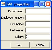
Figure 1: User interface for Example 1
The View Object
In order to control the layout of the interface, it is necessary to define a View object. A View object is a template for a GUI window or panel. In other words, a View specifies the content and appearance of a TraitsUI window or panel display.
For example, suppose you want to construct a GUI window that shows only the first three attributes of a SimpleEmployee (e.g., because salary is confidential and the employee number should not be edited). Furthermore, you would like to specify the order in which those fields appear. You can do this by defining a View object and passing it to the configure_traits() method:
Example 2: Using configure_traits() with a View object
# configure_traits_view.py -- Sample code to demonstrate
#                             configure_traits()

from traits.api import HasTraits, Str, Int
from traitsui.api import View, Item
import traitsui

class SimpleEmployee(HasTraits):
    first_name = Str
    last_name = Str
    department = Str
    employee_number = Str
    salary = Int

view1 = View(Item(name = 'first_name'),
             Item(name = 'last_name'),
             Item(name = 'department'))

sam = SimpleEmployee()
sam.configure_traits(view=view1)
The resulting window has the desired appearance:
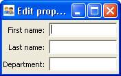
Figure 2: User interface for Example 2
A View object can have a variety of attributes, which are set in the View definition, following any Group or Item objects.
The sections on Contents of a View through Advanced View Concepts explore the contents and capabilities of Views. Refer to the Traits API Reference for details of the View class.
Except as noted, all example code uses the configure_traits() method; a detailed description of this and other techniques for creating GUI displays from Views can be found in Displaying a View.
Contents of a View
The contents of a View are specified primarily in terms of two basic building blocks: Item objects (which, as suggested by Example 2, correspond roughly to individual trait attributes), and Group objects. A given View definition can contain one or more objects of either of these types, which are specified as arguments to the View constructor, as in the case of the three Items in Example 2.
The remainder of this chapter describes the Item and Group classes.
The Item Object
The simplest building block of a View is the Item object. An Item specifies a single interface widget, usually the display for a single trait attribute of a HasTraits object. The content, appearance, and behavior of the widget are controlled by means of the Item object’s attributes, which are usually specified as keyword arguments to the Item constructor, as in the case of name in Example 2.
The remainder of this section describes the attributes of the Item object, grouped by categories of functionality. It is not necessary to understand all of these attributes in order to create useful Items; many of them can usually be left unspecified, as their default values are adequate for most purposes. Indeed, as demonstrated by earlier examples, simply specifying the name of the trait attribute to be displayed is often enough to produce a usable result.
The following table lists the attributes of the Item class, organized by functional categories. Refer to the Traits API Reference for details on the Item class.
Attributes of Item, by category
| Category | Attributes | Description |
|---|---|---|
| Content |
|
These attributes specify the actual data to be displayed by an item. Because an Item is essentially a template for displaying a single trait, its name attribute is nearly always specified. |
| Display format |
|
In addition to specifying which trait attributes are to be displayed, you might need to adjust the format of one or more of the resulting widgets. If an Item’s label attribute is specified but not its name, the value of label is displayed as a simple, non-editable string. (This feature can be useful for displaying comments or instructions in a TraitsUI window.) |
| Content format |
|
In some cases it can be desirable to apply special formatting to a widget’s contents rather than to the widget itself. Examples of such formatting might include rounding a floating-point value to two decimal places, or capitalizing all letter characters in a license plate number. |
| Widget override |
|
These attributes override the widget that is automatically selected by TraitsUI. These options are discussed in Introduction to Trait Editor Factories and The Predefined Trait Editor Factories. |
| Visibility and status |
|
Use these attributes to create a simple form of a dynamic GUI, which alters the display in response to changes in the data it contains. More sophisticated dynamic behavior can be implemented using a custom Handler see Controlling the Interface: the Handler ). |
| User help |
|
These attributes provide guidance to the user in using the user interface. If the help attribute is not defined for an Item, a system-generated message is used instead. The help_id attribute is ignored by the default help handler, but can be used by a custom help handler. |
| Unique identifier |
|
The id attribute is used as a key for saving user preferences about the widget. If id is not specified, the value of the name attribute is used. |
Subclasses of Item
The TraitsUI package defines the following subclasses of Item:
- Label
- Heading
- Spring
These classes are intended to help with the layout of a TraitsUI View, and need not have a trait attribute associated with them. See the Traits API Reference for details.
The Group Object
The preceding sections have shown how to construct windows that display a simple vertical sequence of widgets using instances of the View and Item classes. For more sophisticated interfaces, though, it is often desirable to treat a group of data elements as a unit for reasons that might be visual (e.g., placing the widgets within a labeled border) or logical (activating or deactivating the widgets in response to a single condition, defining group-level help text). In TraitsUI, such grouping is accomplished by means of the Group object.
Consider the following enhancement to Example 2:
pair: configure_traits(); examples triple: View; Group; examples
Example 3: Using configure_traits() with a View and a Group object
# configure_traits_view_group.py -- Sample code to demonstrate
#                                   configure_traits()
from traits.api import HasTraits, Str, Int
from traitsui.api import View, Item, Group
import traitsui

class SimpleEmployee(HasTraits):
    first_name = Str
    last_name = Str
    department = Str

    employee_number = Str
    salary = Int

view1 = View(Group(Item(name = 'first_name'),
                   Item(name = 'last_name'),
                   Item(name = 'department'),
                   label = 'Personnel profile',
                   show_border = True))

sam = SimpleEmployee()
sam.configure_traits(view=view1)
The resulting window shows the same widgets as before, but they are now enclosed in a visible border with a text label:
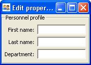
Figure 3: User interface for Example 3
Content of a Group
The content of a Group object is specified exactly like that of a View object. In other words, one or more Item or Group objects are given as arguments to the Group constructor, e.g., the three Items in Example 3. [5] The objects contained in a Group are called the elements of that Group. Groups can be nested to any level.
Group Attributes
The following table lists the attributes of the Group class, organized by functional categories. As with Item attributes, many of these attributes can be left unspecified for any given Group, as the default values usually lead to acceptable displays and behavior.
See the Traits API Reference for details of the Group class.
Attributes of Group, by category
| Category | Attributes | Description |
|---|---|---|
| Content |
|
The object attribute references the object whose traits are being edited by members of the group; by default this is ‘object’, but could be another object in the current context. The content attribute is a list of elements in the group. |
| Display format |
|
These attributes define display options for the group as a whole. |
| Visibility and status |
|
These attributes work similarly to the attributes of the same names on the Item class. |
| User help |
|
The help text is used by the default help handler only if the group is the only top-level group for the current View. For example, suppose help text is defined for a Group called group1. The following View shows this text in its help window: View(group1)
The following two do not: View(group1, group2)
View(Group(group1))
The help_id attribute is ignored by the default help handler, but can be used by a custom help handler. |
| Unique identifier |
|
The id attribute is used as a key for saving user preferences about the widget. If id is not specified, the id values of the elements of the group are concatenated and used as the group identifier. |
Subclasses of Group
The TraitsUI package defines the following subclasses of Group, which are helpful shorthands for defining certain types of groups. Refer to the Traits API Reference for details.
Subclasses of Group
| Subclass | Description | Equivalent To |
|---|---|---|
| HGroup | A group whose items are laid out horizontally. | Group(orientation='horizontal') |
| HFlow | A horizontal group whose items “wrap” when they exceed the available horizontal space. | Group(orientation='horizontal', layout='flow', show_labels=False) |
| HSplit | A horizontal group with splitter bars to separate it from other groups. | Group(orientation='horizontal', layout='split') |
| Tabbed | A group that is shown as a tab in a notebook. | Group(orientation='horizontal' layout='tabbed', springy=True) |
| VGroup | A group whose items are laid out vertically. | Group(orientation='vertical') |
| VFlow | A vertical group whose items “wrap” when they exceed the available vertical space. | Group(orientation='vertical', layout='flow', show_labels=False) |
| VFold | A vertical group in which items can be collapsed (i.e., folded) by clicking their titles. | Group(orientation='vertical', layout='fold', show_labels=False) |
| VGrid | A vertical group whose items are laid out in two columns. | Group(orientation='vertical', columns=2) |
| VSplit | A vertical group with splitter bars to separate it from other groups. | Group(orientation='vertical', layout='split') |
Footnotes
| [3] | If the code is being run from a program that already has a GUI defined, then use edit_traits() instead of configure_traits(). These methods are discussed in more detail in Displaying a View. |
| [4] | All code examples in this guide that include a file name are also available as examples in the tutorials/doc_examples/examples subdirectory of the Traits docs directory. You can run them individually, or view them in a tutorial program by running: python Traits_dir/tutorials/tutor.py Traits_dir/docs/tutorials/doc_examples |
| [5] | As with Views, it is possible for a Group to contain objects of more than one type, but it is not recommended. |
Project Versions
RTD Search
Full-text doc search.