The Predefined Trait Editor Factories
This chapter contains individual descriptions of the predefined trait editor factories provided by TraitsUI. Most of these editor factories are straightforward and can be used easily with little or no expertise on the part of the programmer or end user; these are described in Basic Trait Editor Factories. The section Advanced Trait Editors covers a smaller set of specialized editors that have more complex interfaces or that are designed to be used along with complex editors.
Note
Examples are toolkit-specific.
The exact appearance of the editors depends on the underlying GUI toolkit. The screenshots and descriptions in this chapter contain a mix of both wx and Qt.
Rather than trying to memorize all the information in this chapter, you might skim it to get a general idea of the available trait editors and their capabilities, and use it as a reference thereafter.
Basic Trait Editor Factories
The editor factories described in the following sections are straightforward to use. You can pass the editor object returned by the editor factory as the value of the editor keyword parameter when defining a trait.
ArrayEditor()
- Suitable for
2-D Array, 2-D CArray
- Default for
Array, CArray (if 2-D)
- Optional parameter
width
The editors generated by ArrayEditor() provide text fields (or static text for the read-only style) for each cell of a two-dimensional NumPy array. Only the simple and read-only styles are supported by the wxWidgets implementation. You can specify the width of the text fields with the width parameter.
This editor is only suitable for small arrays. For editing large two-dimensional arrays use the ArrayViewEditor instead
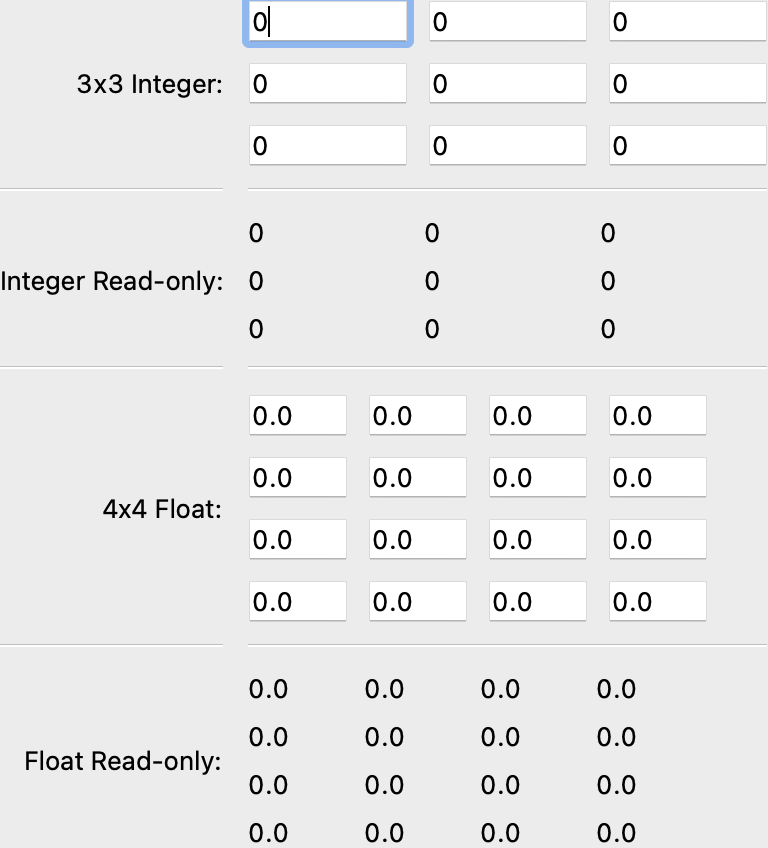
Figure 21: Array editors
The following code generates the editors shown in Figure 21.
Example 14: Demonstration of array editors
"""Demo of the ArrayEditor"""

import numpy as np

from traits.api import Array, HasPrivateTraits
from traitsui.api import ArrayEditor, Item, View
from traitsui.menu import NoButtons


class ArrayEditorTest(HasPrivateTraits):

    three = Array(np.int64, (3, 3))

    four = Array(
        np.float64,
        (4, 4),
        editor=ArrayEditor(width=-50),
    )

    view = View(
        Item('three', label='3x3 Integer'),
        '_',
        Item('three', label='Integer Read-only', style='readonly'),
        '_',
        Item('four', label='4x4 Float'),
        '_',
        Item('four', label='Float Read-only', style='readonly'),
        buttons=NoButtons,
        resizable=True,
    )


demo = ArrayEditorTest()

if __name__ == '__main__':
    demo.configure_traits()
BooleanEditor()
- Suitable for
Bool, CBool
- Default for
Bool, CBool
- Optional parameters
mapping
BooleanEditor is one of the simplest of the built-in editor factories in the TraitsUI package. It is used exclusively to edit and display Boolean (i.e, True/False) traits. In the simple and custom styles, it generates a checkbox. In the text style, the editor displays the trait value (as one would expect) as the strings True or False. However, several variations are accepted as input:
'True'TYesy'False'FNon
The set of acceptable text inputs can be changed by setting the BooleanEditor() parameter mapping to a dictionary whose entries are of the form str: val, where val is either True or False and str is a string that is acceptable as text input in place of that value. For example, to create a Boolean editor that accepts only yes and no as appropriate text values, you might use the following expression:
editor=BooleanEditor(mapping={"yes": True, "no": False})
Note that in this case, the strings True and False would not be acceptable as text input.
Figure 22 shows the four styles generated by BooleanEditor().
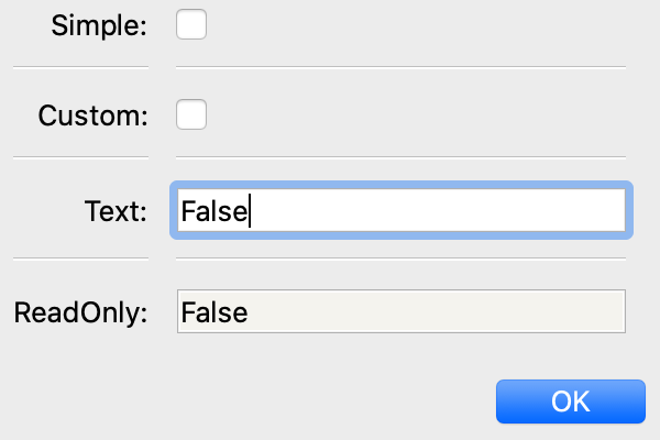
Figure 22: Boolean editor styles
ButtonEditor()
- Suitable for
Button, Event, ToolbarButton
- Default for
Button, ToolbarButton
- Optional parameters
height_padding, image, label, label_value, orientation, style, value, values_trait, view, width_padding
The ButtonEditor() factory is designed to be used with an Event or Button 16 trait. When a user clicks a button editor, the associated event is fired. Because events are not printable objects, the text and read-only styles are not implemented for this editor. The simple and custom styles of this editor are identical.
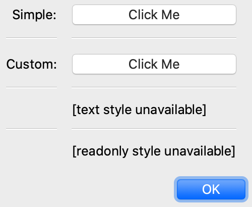
Figure 23: Button editor styles
By default, the label of the button is the name of the Button or Event trait to which it is linked. 17 However, this label can be set to any string by specifying the label parameter of ButtonEditor() as that string.
Alternatively, use label_value to specify the name of the trait to use as the button label.
You can specify a value for the trait to be set to, using the value parameter. If the trait is an Event, then the value is not stored, but might be useful to an event listener.
Use values_trait to specify the name of the trait on the object that contains the list of possible values. If this is set, then the value, label, and label_value traits are ignored; instead, they will be set from this list. When this button is clicked, the value set will be the one selected from the drop-down.
CheckListEditor()
- Suitable for
List
- Default for
(none)
- Optional parameters
cols, name, values
The editors generated by the CheckListEditor() factory are designed to enable the user to edit a List trait by selecting elements from a “master list”, i.e., a list of possible values. The list of values can be supplied by the trait being edited, or by the values parameter.
The values parameter can take either of two forms:
A list of strings
A list of tuples of the form (element, label), where element can be of any type and label is a string.
In the latter case, the user selects from the labels, but the underlying trait is a List of the corresponding element values.
Alternatively, you can use the name parameter to specify a trait attribute containing the label strings for the values.
The custom style of editor from this factory is displayed as a set of checkboxes. By default, these checkboxes are displayed in a single column; however, you can initialize the cols parameter of the editor factory to any value between 1 and 20, in which case the corresponding number of columns is used.
The simple style generated by CheckListEditor() appears as a drop-down list; in this style, only one list element can be selected, so it returns a list with a single item. The text and read-only styles represent the current contents of the attribute in Python-style text format; in these cases the user cannot see the master list values that have not been selected.
The four styles generated by CheckListEditor() are shown in Figure 24. Note that in this case the cols parameter has been set to 4.
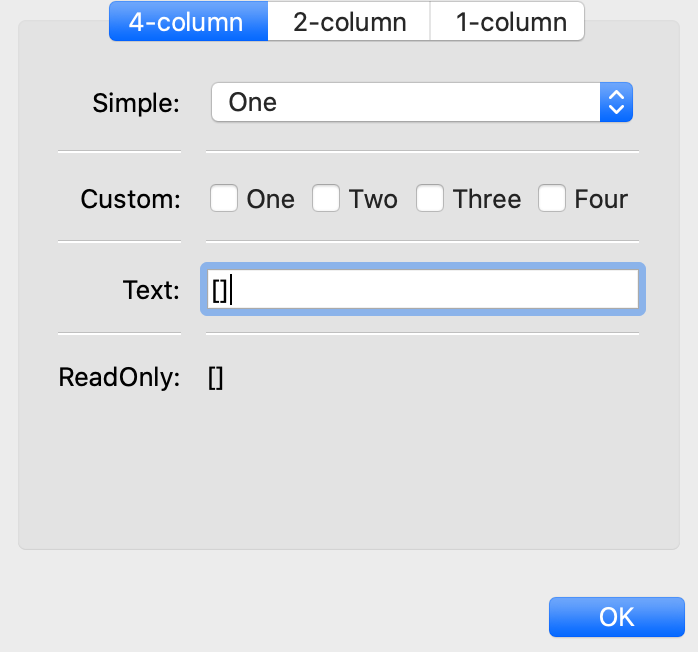
Figure 24: Checklist editor styles
CodeEditor()
- Suitable for
Code, Str, String
- Default for
Code
- Optional parameters
auto_set
The purpose of a code editor is to display and edit Code traits, though it can be used with the Str and String trait types as well. In the simple, text, and custom styles (which are identical for this editor), the text is displayed in numbered, non-wrapping lines with a horizontal scrollbar. The read-only style is similar to the other styles except that the text is not editable.
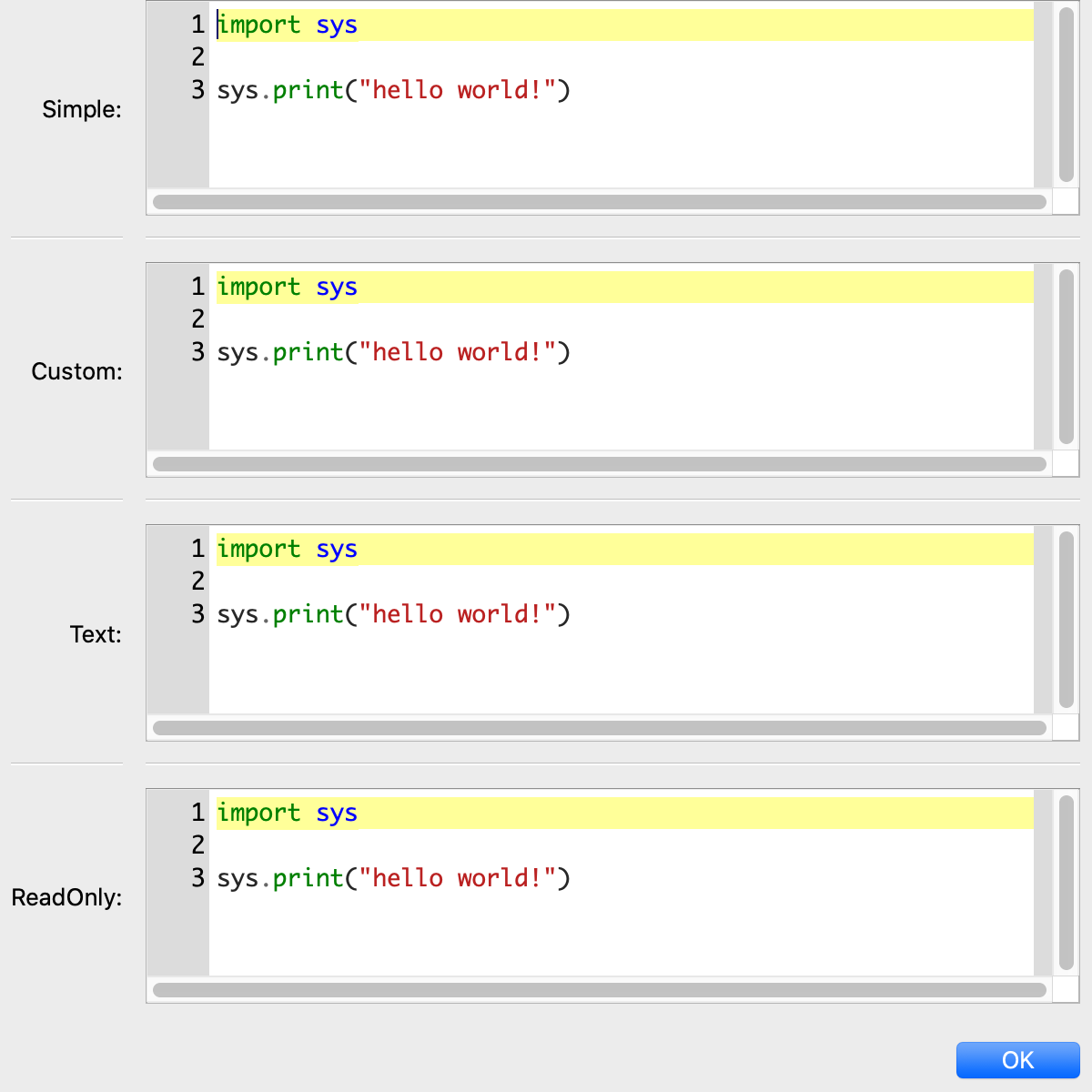
Figure 25: Code editor styles
The auto_set keyword parameter is a Boolean value indicating whether the trait being edited should be updated with every keystroke (True) or only when the editor loses focus, i.e., when the user tabs away from it or closes the window (False). The default value of this parameter is True.
ColorEditor()
- Suitable for
Color
- Default for
Color
- Optional parameters
mapped
The editors generated by ColorEditor() are designed to enable the user to display a Color trait or edit it by selecting a color from the palette available in the underlying GUI toolkit. The four styles of color editor are shown in Figure 26.
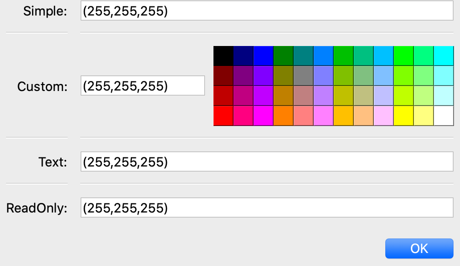
Figure 26: Color editor styles
In the simple style, the editor appears as a text box. The text in the box is either a color name or a tuple of the form (r, g, b) where r, g, and b are the numeric values of the red, green and blue color components respectively. (Which representation is used depends on how the value was entered.) The text value is not directly editable in this style of editor; instead, clicking on the text box displays a pop-up panel similar in appearance and function to the custom style.
The custom style includes a labeled color swatch on the left, representing the current value of the Color trait, and a palette of common color choices on the right. Clicking on any tile of the palette changes the color selection, causing the swatch to update accordingly. Clicking on the swatch itself causes a more detailed, platform-specific interface to appear in a dialog box, such as is shown in Figure 27.
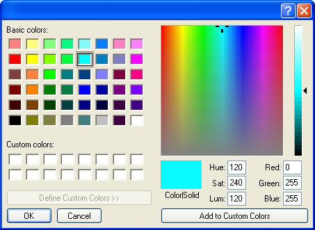
Figure 27: Custom color selection dialog box for Microsoft Windows XP
The text style of editor looks exactly like the simple style, but the text box is editable (and clicking on it does not open a pop-up panel). The user must enter a recognized color name or a properly formatted (r, g, b) tuple.
The read-only style displays the text representation of the currently selected Color value (name or tuple) on a minimally-sized background of the corresponding color.
For advanced users: The mapped keyword parameter of ColorEditor() is a Boolean value indicating whether the trait being edited has a built-in mapping of user-oriented representations (e.g., strings) to internal representations. Since ColorEditor() is generally used only for Color traits, which are mapped (e.g., ‘cyan’ to wx.Colour(0,255,255) ), this parameter defaults to True and is not of interest to most programmers. However, it is possible to define a custom color trait that uses ColorEditor() but is not mapped (i.e., uses only one representation), which is why the attribute is available.
CompoundEditor()
- Suitable for
special
- Default for
“compound” traits
- Optional parameters
auto_set
An editor generated by CompoundEditor() consists of a combination of the editors for trait types that compose the compound trait. The widgets for the compound editor are of the style specified for the compound editor (simple, custom, etc.). The editors shown in Figure 28 are for the following trait, whose value can be an integer between 1 and 6, or any of the letters ‘a’ through ‘f’:
compound_trait = Trait(1, Range(1, 6), 'a', 'b', 'c', 'd', 'e', 'f')
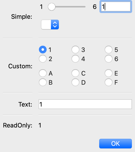
Figure 28: Example compound editor styles
The auto_set keyword parameter is a Boolean value indicating whether the trait being edited should be updated with every keystroke (True) or only when the editor loses focus, i.e., when the user tabs away from it or closes the window (False). The default value of this parameter is True.
CSVListEditor()
- Suitable for
lists of simple data types
- Default for
none
- Optional parameters
auto_set, enter_set, ignore_trailing_sep, sep
This editor provides a line of text for editing a list of certain simple data types. The following List traits can be edited by a CSVListEditor:
List(Int)
List(Float)
List(Str)
List(Enum(‘string1’, ‘string2’, etc))
List(Range(low= low value or trait name, high= high value or trait name))
The ‘text’, ‘simple’ and ‘custom’ styles are all the same. They provide a single line of text in which the user can enter the list. The ‘readonly’ style provides a line of text that can not be edited by the user.
The default separator of items in the list is a comma. This can be overridden with the sep keyword parameter.
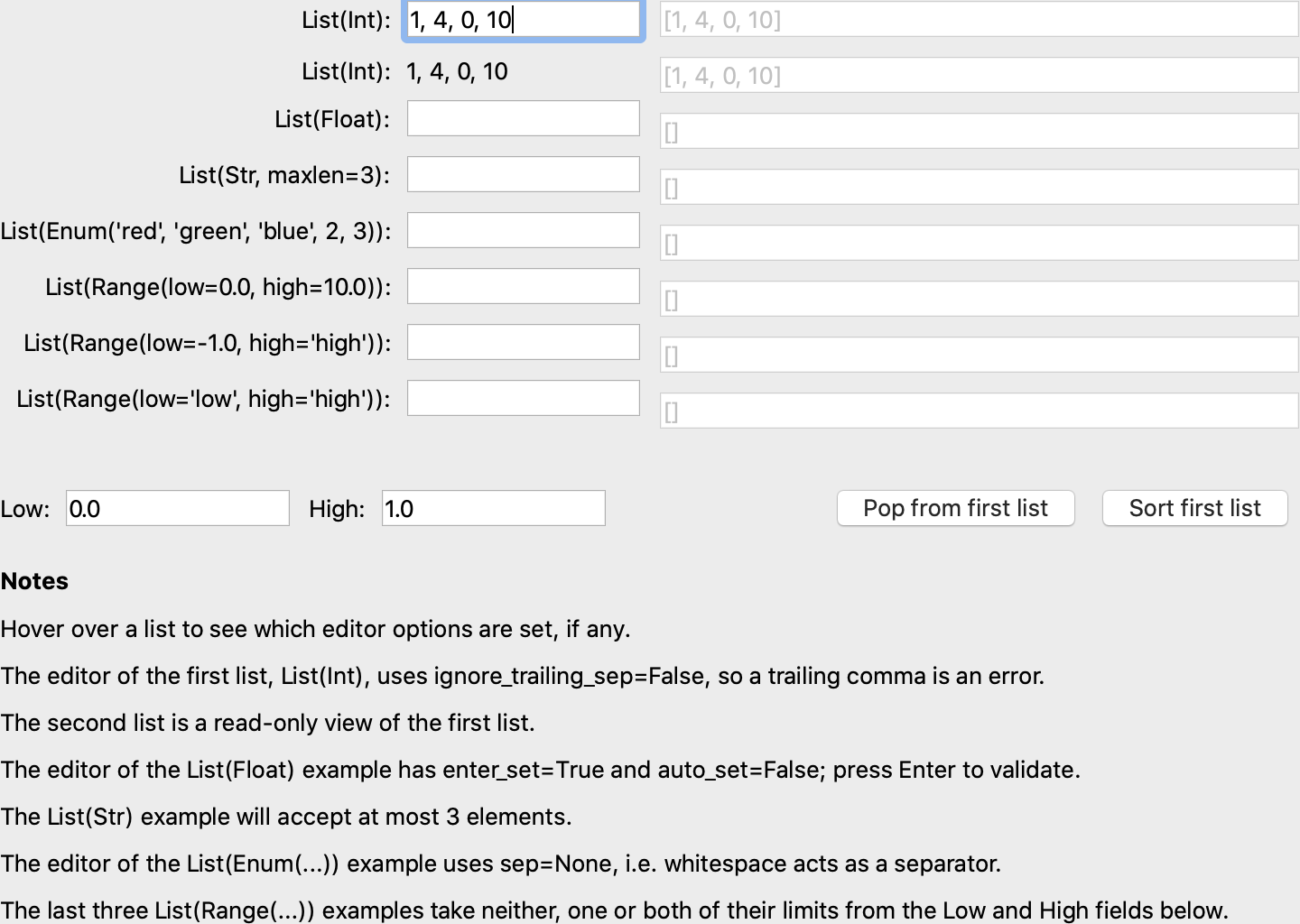
Figure 29: Example CSV list editor styles
Parameters
- auto_setbool
If auto_set is True, each key pressed by the user triggers validation of the input, and if it is valid, the value of the object being edited is updated. Default: True
- enter_setbool
If enter_set is True, the input is updated when the user presses the Enter key. Default: False
- sepstr or None
The separator of the list item in the text field. If sep is None, each contiguous span of whitespace is a separator. (Note: After the text field is split at the occurrences of sep, leading and trailing whitespace is removed from each item before converting to the underlying data type.) Default: ‘,’ (a comma)
- ignore_trailing_sepbool
If ignore_trailing_sep is True, the user may enter a trailing separator (e.g. ‘1, 2, 3,’) and it will be ignored. If this is False, a trailing separator is an error. Default: True
See Also
ListEditor, TextEditor
DateEditor()
- Suitable for
Date, List(Date) (custom style only)
- Default for
Date
- Optional parameters
allow_future, message, months, multi_select, on_mixed_select, padding, shift_to_select, selected_style, strftime, view
The DateEditor() displays a Python datetime.date object, usually supplied via a Date trait. The simple style shows a date spin control, while the custom style shows one (or potentially more in the wx backend) months in a calendar view. Dates can be restricted to past-only by setting allow_future to False.
The custom style can also be used for the selection of multiple dates as an ordered list of dates by setting multi_select to True. The styling of the selected dates can be controlled via setting the selected_style to a CellFormat() instance.
For readonly style, the user can set the message to display if the date value is None, and a date format string for use with strftime.
DatetimeEditor()
- Suitable for
Datetime
- Default for
Datetime
- Optional parameters
maximum_datetime, message, minimum_datetime, strftime
The DatetimeEditor() displays a Python datetime.datetime object, usually supplied via a Datetime trait. The simple style shows a datetime spin control, and maximum and minimum selectable datetimes can be supplied to restrict the range of values.
For readonly style, the user can set the message to display if the datetime value is None, and a datetime format string for use with strftime.
The DatetimeEditor is not yet available for the wxPython backend.
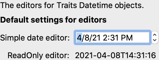
Figure 30: Example Datetime editor styles
DirectoryEditor()
- Suitable for
Directory
- Default for
Directory
- Optional parameters
entries, filter, filter_name, reload_name, truncate_ext, dclick_name
A directory editor enables the user to display a Directory trait or set it to some directory in the local system hierarchy. The four styles of this editor are shown in Figure 29.
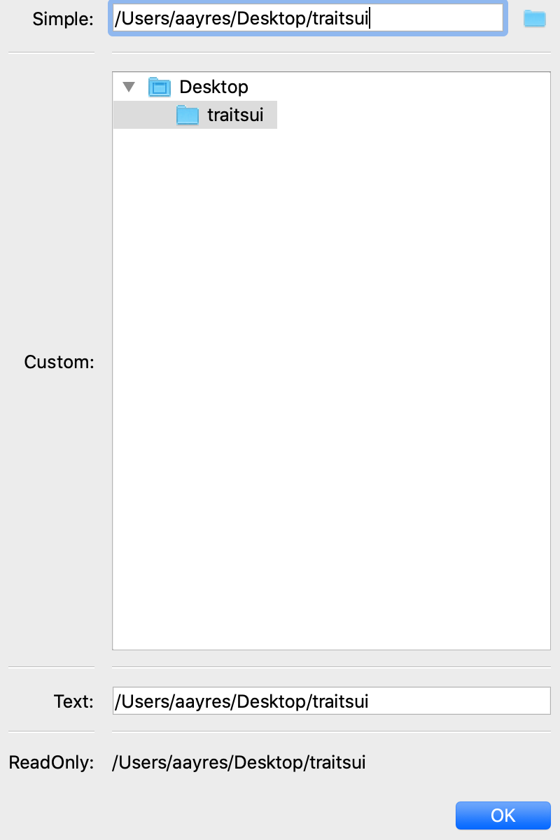
Figure 31: Directory editor styles
In the simple style, the current value of the trait is displayed in a combo box to the left of a button labeled ‘…’. The user can type a new path directly into the text box, select a previous value from the droplist of the combo box, or use the button to bring up a directory browser panel similar to the custom style of editor.
When the user selects a directory in this browser, the panel collapses, and control is returned to the original editor widget, which is automatically populated with the new path string.
The user can also drag and drop a directory object onto the simple style editor.
The custom style displays a directory browser panel, in which the user can expand or collapse directory structures, and click a folder icon to select a directory.
The text style of editor is simply a text box into which the user can type a directory path. The ‘readonly’ style is identical to the text style, except that the text box is not editable.
The optional parameters are the same as the FileEditor.
No validation is performed on Directory traits; the user must ensure that a typed-in value is in fact an actual directory on the system.
EnumEditor()
- Suitable for
Enum, Any
- Default for
Enum
- Required parameters
for non-Enum traits: values or name
- Optional parameters
cols, evaluate, mode, completion_mode (Qt only)
The editors generated by EnumEditor() enable the user to pick a single value from a closed set of values.
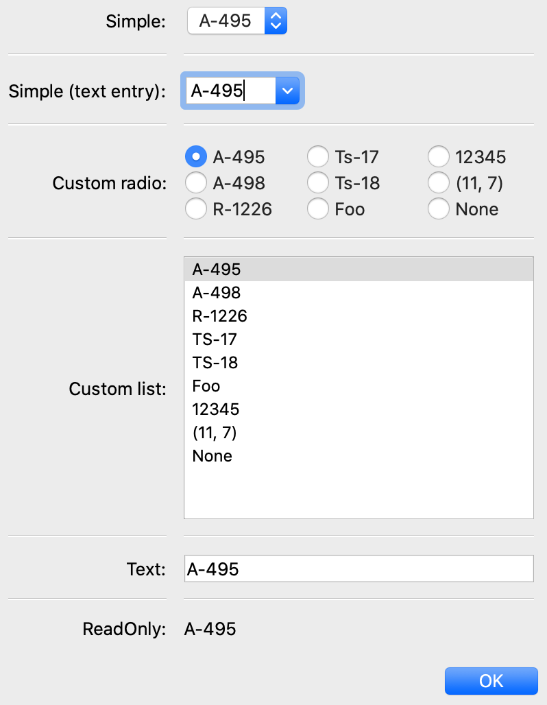
Figure 32: Enumeration editor styles
The simple style of editor is a drop-down list box. If evaluate is True then the user can also enter text. The completion_mode parameter controls how to display partially matching values, either as inline text when there is only one matching enumeration, or as a popup menu of all possible matches.
The custom style is a set of radio buttons. Use the cols parameter to specify the number of columns of radio buttons.
The text style is an editable text field; if the user enters a value that is not in enumerated set, the background of the field turns red, to indicate an error. You can specify a function to evaluate text input, using the evaluate parameter.
The read-only style is the value of the trait as static text.
If the trait attribute that is being edited is not an enumeration, you must specify either the trait attribute (with the name parameter), or the set of values to display (with the values parameter). The name parameter can be an extended trait name. The values parameter can be a list, tuple, or dictionary, or a “mapped” trait.
By default, an enumeration editor sorts its values alphabetically. To specify a different order for the items, give it a mapping from the normal values to ones with a numeric tag. The enumeration editor sorts the values based on the numeric tags, and then strips out the tags.
Example 15: Enumeration editor with mapped values
# enum_editor.py -- Example of using an enumeration editor

from traits.api import Enum, HasTraits
from traitsui.api import EnumEditor, Item, View


class EnumExample(HasTraits):
    priority = Enum('Medium', 'Highest', 'High', 'Low', 'Lowest')

    view = View(
        Item(
            name='priority',
            editor=EnumEditor(
                values={
                    'Highest': '1:Highest',
                    'High': '2:High',
                    'Medium': '3:Medium',
                    'Low': '4:Low',
                    'Lowest': '5:Lowest',
                }
            ),
        ),
    )


EnumExample().configure_traits()
The enumeration editor strips the characters up to and including the colon. It assumes that all the items have the colon in the same position; therefore, if some of your tags have multiple digits, you should use zeros to pad the items that have fewer digits.
FileEditor()
- Suitable for
File
- Default for
File
- Optional parameters
entries, filter, filter_name, reload_name, truncate_ext, dclick_name, dialog_style
A file editor enables the user to display a File trait or set it to some file in the local system hierarchy. The styles of this editor are shown in the following Figure.
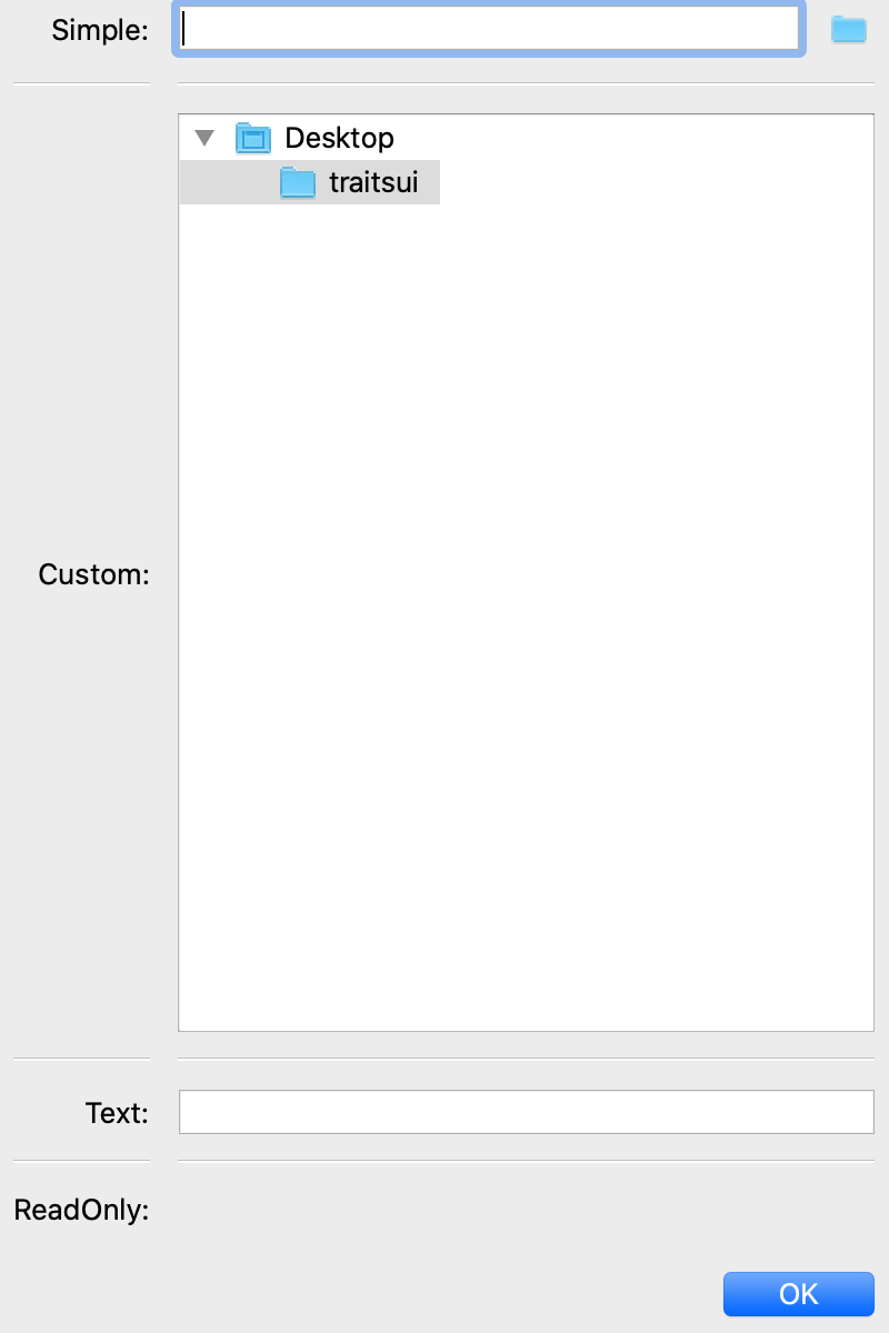
Figure 33: File editor styles
The default version of the simply style displays a text box and a Browse button. Clicking Browse opens a platform-specific file selection dialog box. On the wx backend, if you specify the entries keyword parameter with an integer value to the factory function, the simple style is a combo box and a button labeled …. The user can type a file path in the combo box, or select one of entries previous values. Support for the entries parameter is yet to be implemented on the qt backend. Clicking the … button opens a browser panel similar to the custom style of editor. When the user selects a file in this browser, the panel collapses, and control is returned to the original editor widget, which is automatically populated with the new path string.
For either version of the simple style, the user can drag and drop a file object onto the control.
The custom style displays a file system browser panel, in which the user can expand or collapse directory structures, and click an icon to select a file.
You can specify a list of filters to apply to the file names displayed, using
the filter keyword parameter of the factory function. For example, you could
use a filter value of ['*.py'] to display only Python source files.
You can also specify this parameter for the simple style, and it will be used
in the file selection dialog box or pop-up file system browser panel.
Alternatively, you can specify filter_name, whose value is an
extended trait name of a trait attribute that contains the list of filters.
The reload_name parameter is an extended trait name of a trait attribute that is used to notify the editor when the view of the file system needs to be reloaded.
The truncate_ext parameter is a Boolean that indicates whether the file extension is removed from the returned filename. It is False by default, meaning that the filename is not modified before it is returned.
The dclick_name parameter is an extended trait name of a trait event which is fired when the user double-clicks on a file name when using the custom style.
When using the simple style, the dialog_style parameter controls the type of
file dialog that will open when the user clicks on the folder icon. Setting the
value of open makes the control pop up an “Open File” dialog; setting the
value of save will result in a “Save As” dialog.
FontEditor()
- Suitable for
Font
- Default for
Font
A font editor enables the user to display a Font trait or edit it by selecting one of the fonts provided by the underlying GUI toolkit. The four styles of this editor are shown in Figure 32.
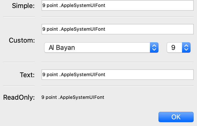
Figure 34: Font editor styles
In the simple style, the currently selected font appears in a display similar to a text box, except that when the user clicks on it, a platform-specific dialog box appears with a detailed interface, such as is shown in Figure 33. When the user clicks OK, control returns to the editor, which then displays the newly selected font.
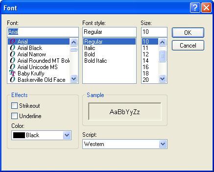
Figure 33: Example font dialog box for Microsoft Windows
In the custom style, an abbreviated version of the font dialog box is displayed in-line. The user can either type the name of the font in the text box or use the two drop-down lists to select a typeface and size.
In the text style, the user must type the name of a font in the text box provided. No validation is performed; the user must enter the correct name of an available font. The read-only style is identical except that the text is not editable.
HistoryEditor()
- Suitable for
string traits
- Default for
(none)
- Optional parameters
entries
HistoryEditor() generates a combo box, which allows the user to either enter a text string or select a value from a list of previously-entered values. The same control is used for all editor styles. The entries parameter determines how many entries are preserved in the history list. This type of control is used as part of the simple style of file editor; see FileEditor().
HTMLEditor()
- Suitable for
HTML, string traits
- Default for
HTML
- Optional parameters
format_text
The “editor” generated by HTMLEditor() interprets and displays text as HTML. It does not support the user editing the text that it displays. It generates the same type of editor, regardless of the style specified. Figure 34 shows an HTML editor in the upper pane, with a code editor in the lower pane, displaying the uninterpreted text.
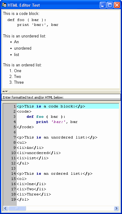
Figure 34: Example HTML editor, with code editor showing original text
Note
HTML support is limited in the wxWidgets toolkit.
The set of tags supported by the wxWidgets implementation of the HTML editor is a subset of the HTML standard. It does not support style sheets or complex formatting. Refer to the wxWidgets documentation for details.
If the format_text argument is True, then the HTML editor supports basic implicit formatting, which it converts to HTML before passing the text to the HTML interpreter. The implicit formatting follows these rules:
Indented lines that start with a dash (‘-’) are converted to unordered lists.
Indented lines that start with an asterisk (‘*’) are converted to ordered lists.
Indented lines that start with any other character are converted to code blocks.
Blank lines are converted to paragraph separators.
The following text produces the same displayed HTML as in Figure 34, when format_text is True:
This is a code block:

    def foo ( bar ):
        print 'bar:', bar

This is an unordered list:
 - An
 - unordered
 - list

This is an ordered list:
 * One
 * Two
 * Three
ImageEditor()
- Suitable for
(any)
- Default for
(none)
- Optional parameters
image, scale, preserve_aspect_ratio, allow_upscaling, allow_clipping
ImageEditor() generates a read-only display of an image. The image to be displayed is determined by the image parameter, or by the value of the trait attribute being edited, if image is not specified. In either case, the value must be a Pyface ImageResource (pyface.api.ImageResource), or a string that can be converted to one. If image is specified, then the type and value of the trait attribute being edited are irrelevant and are ignored.
For the Qt backend scale, preserve_aspect_ratio, allow_upscaling, and allow_clipping control whether the image should be scaled or not, and how to perform that scaling.
ImageEnumEditor()
- Suitable for
Enum, Any
- Default for
(none)
- Required parameters
for non-Enum traits: values or name
- Optional parameters
path, klass or module, cols, evaluate, suffix
The editors generated by ImageEnumEditor() enable the user to select an item in an enumeration by selecting an image that represents the item.
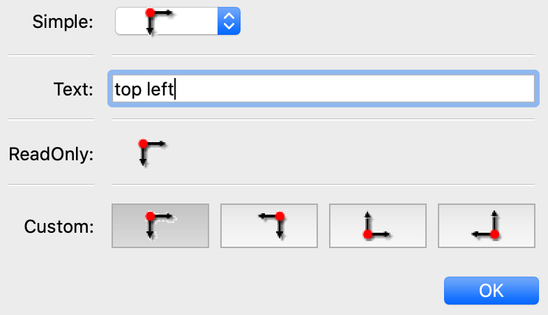
Figure 35: Editor styles for image enumeration
The custom style of editor displays a set of images; the user selects one by clicking it, and it becomes highlighted to indicate that it is selected.
The simple style displays a button with an image for the currently selected item. When the user clicks the button, a pop-up panel displays a set of images, similar to the custom style. The user clicks an image, which becomes the new image on the button.
The text style does not display images; it displays the text representation of the currently selected item. The user must type the text representation of another item to select it.
The read-only style displays the image for the currently selected item, which the user cannot change.
The ImageEnumEditor() function accepts the same parameters as the EnumEditor() function (see EnumEditor()), as well as some additional parameters.
Note
Image enumeration editors do not use ImageResource.
Unlike most other images in the Traits and TraitsUI packages, images in the wxWindows implementation of image enumeration editors do not use the Pyface ImageResource class.
In the wxWidgets implementation, image enumeration editors use the following rules to locate images to use:
Only GIF (.gif) images are currently supported.
The base file name of the image is the string representation of the value, with spaces replaced by underscores and the suffix argument, if any, appended. Note that suffix is not a file extension, but rather a string appended to the base file name. For example, if suffix is
_originand the value is ‘top left’, the image file name istop_left_origin.gif.If the path parameter is defined, it is used to locate the file. It can be absolute or relative to the file where the image enumeration editor is defined.
If path is not defined and the klass parameter is defined, it is used to locate the file. The klass parameter must be a reference to a class. The editor searches for an images subdirectory in the following locations:
The directory that contains the module that defines the class.
If the class was executed directly, the current working directory.
If path and klass are not defined, and the module parameter is defined, it is used to locate the file. The module parameter must be a reference to a module. The editor searches for an images subdirectory of the directory that contains the module.
If path, klass, and module are not defined, the editor searches for an images subdirectory of the traitsui.wx package.
If none of the above paths are defined, the editor searches for an
imagesdirectory that is a sibling of the directory from which the application was run.
InstanceEditor()
- Suitable for
Instance, Property, self, This
- Default for
Instance, self, This
- Optional parameters
cachable, editable, id, kind, label, name, object, orientation, values, view
The editors generated by InstanceEditor() enable the user to select an instance, or edit an instance, or both.
Editing a Single Instance
In the simplest case, the user can modify the trait attributes of an instance assigned to a trait attribute, but cannot modify which instance is assigned.
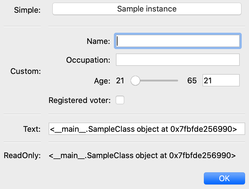
Figure 36: Editor styles for instances
The custom style displays a user interface panel for editing the trait attributes of the instance. The simple style displays a button, which when clicked, opens a window containing a user interface for the instance. The kind parameter specifies the kind of window to open (see Stand-alone Windows). The label parameter specifies a label for the button in the simple interface. The view parameter specifies a view to use for the referenced instance’s user interface; if this is not specified, the default view for the instance is used (see Defining a Default View).
The text and read-only styles display the string representation of the instance. They therefore cannot be used to modify the attributes of the instance. A user could modify the assigned instance if they happened to know the memory address of another instance of the same type, which is unlikely. These styles can useful for prototyping and debugging, but not for real applications.
Selecting Instances
You can add an option to select a different instance to edit. Use the name parameter to specify the extended name of a trait attribute in the context that contains a list of instances that can be selected or edited. (See The View Context for an explanation of contexts.) Using these parameters results in a drop-drown list box containing a list of text representations of the available instances. If the instances have a name trait attribute, it is used for the string in the list; otherwise, a user-friendly version of the class name is used.
For example, the following code defines a Team class and a Person class. A Team has a roster of Persons, and a captain. In the view for a team, the user can pick a captain and edit that person’s information.
Example 16: Instance editor with instance selection
# instance_editor_selection.py -- Example of an instance editor with instance
# selection

from traits.api import HasStrictTraits, Instance, Int, List, Regex, Str
from traitsui.api import InstanceEditor, Item, View


class Person(HasStrictTraits):
    name = Str()
    age = Int()
    phone = Regex(value='000-0000', regex=r'\d\d\d[-]\d\d\d\d')

    traits_view = View('name', 'age', 'phone')


people = [
    Person(name='Dave', age=39, phone='555-1212'),
    Person(name='Mike', age=28, phone='555-3526'),
    Person(name='Joe', age=34, phone='555-6943'),
    Person(name='Tom', age=22, phone='555-7586'),
    Person(name='Dick', age=63, phone='555-3895'),
    Person(name='Harry', age=46, phone='555-3285'),
    Person(name='Sally', age=43, phone='555-8797'),
    Person(name='Fields', age=31, phone='555-3547'),
]


class Team(HasStrictTraits):

    name = Str()
    captain = Instance(Person)
    roster = List(Person)

    traits_view = View(
        Item('name'),
        Item('_'),
        Item(
            'captain',
            label='Team Captain',
            editor=InstanceEditor(name='roster', editable=True),
            style='custom',
        ),
        buttons=['OK'],
    )


if __name__ == '__main__':
    team = Team(name='Vultures', captain=people[0], roster=people)
    team.configure_traits()
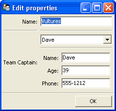
Figure 37: User interface for Example 16
If you want the user to be able to select instances, but not modify their contents, set the editable parameter to False. In that case, only the selection list for the instances appears, without the user interface for modifying instances.
Allowing Instances
You can specify what types of instances can be edited in an instance editor, using the values parameter. This parameter is a list of items describing the type of selectable or editable instances. These items must be instances of subclasses of traitsui.api.InstanceChoiceItem. If you want to generate new instances, put an InstanceFactoryChoice instance in the values list that describes the instance to create. If you want certain types of instances to be dropped on the editor, use an InstanceDropChoice instance in the values list.
ListEditor()
- Suitable for
List
- Default for
List 18
- Optional parameters
editor, rows, style, scrollable, trait_handler, use_notebook
The following parameters are used only if use_notebook is True: deletable, dock_style, export, page_name, select, view
The editors generated by ListEditor() enable the user to modify the contents of a list, both by editing the individual items and by adding, deleting, and reordering items within the list.
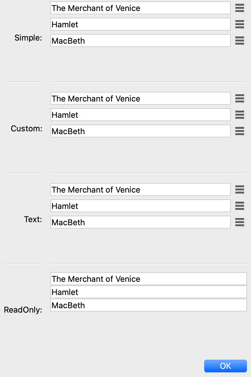
Figure 38: List editor styles
The simple style displays a single item at a time, with small arrows on the right side to scroll the display. The custom style shows multiple items. The number of items displayed is controlled by the rows parameter; if the number of items in the list exceeds this value, then the list display scrolls. If the scrollable parameter is False, the editor displays all objects in the list and does not render the vertical scrollbar. The editor used for each item in the list is determined by the editor and style parameters. The text style of list editor is identical to the custom style, except that the editors for the items are text editors. The read-only style displays the contents of the list as static text.
By default, the items use the trait handler appropriate to the type of items in the list. You can specify a different handler to use for the items using the trait_handler parameter.
For the simple, custom, and text list editors, a button appears to the left of each item editor; clicking this button opens a context menu for modifying the list, as shown in Figure 39.
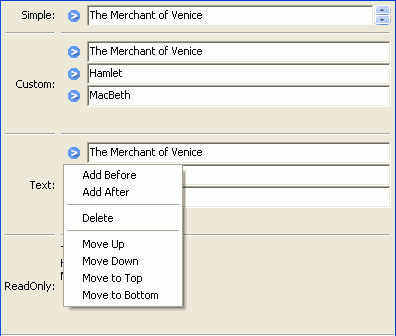
Figure 39: List editor showing context menu
In addition to the four standard styles for list editors, a fifth list editor user interface option is available. If use_notebook is True, then the list editor displays the list as a “notebook” of tabbed pages, one for each item in the list, as shown in Figure 40. This style can be useful in cases where the list items are instances with their own views. If the deletable parameter is True, a close box appears on each tab, allowing the user to delete the item; the user cannot add items interactively through this style of editor.
Figure 40: Notebook list editor
LEDEditor()
- Suitable for
numeric traits
- Default for
(none)
- Optional parameters
alignment, format_str
LEDEditor() generates a display that resembles a “digital” display using light-emitting diodes. All styles of this editor are the same, and are read-only.
The alignment parameter can be ‘left’, ‘center’, or ‘right’ to indicate how the value should be aligned within the display. The default is right-alignment.
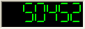
Figure 56: LED Editor with right alignment
ListStrEditor()
- Suitable for
ListStr or List of values mapped to strings
- Default for
(none)
- Optional parameters
activated, activated_index, adapter, adapter_name, auto_add, drag_move, editable, horizontal_lines, images, multi_select, operations, right_clicked, right_clicked_index, selected, selected_index, title, title_name
ListStrEditor() generates a list of selectable items corresponding to items in the underlying trait attribute. All styles of the editor are the same. The parameters to ListStrEditor() control aspects of the behavior of the editor, such as what operations it allows on list items, whether items are editable, and whether more than one can be selected at a time. You can also specify extended references for trait attributes to synchronize with user actions, such as the item that is currently selected, activated for editing, or right-clicked.
Figure 41: List string editor
NullEditor()
- Suitable for
controlling layout
- Default for
(none)
The NullEditor() factory generates a completely empty panel. It is used by the Spring subclass of Item, to generate a blank space that uses all available extra space along its layout orientation. You can also use it to create a blank area of a fixed height and width.
RangeEditor()
- Suitable for
Range
- Default for
Range
- Optional parameters
auto_set, cols, enter_set, format, high_label, high_name, label_width, low_label, low_name, mode
The editors generated by RangeEditor() enable the user to specify numeric values within a range. The widgets used to display the range vary depending on both the numeric type and the size of the range, as described in Table 8 and shown in Figure 42. If one limit of the range is unspecified, then a text editor is used.
Table 8: Range editor widgets
Data type/range size |
Simple |
Custom |
Text |
Read-only |
|---|---|---|---|---|
Integer: Small Range (Size 0-16) |
Slider with text box |
Radio buttons |
Text field |
Static text |
Integer: Medium Range (Size 17-101) |
Slider with text box |
Slider with text box |
Text field |
Static text |
Integer: Large Range (Size > 101) |
Spin box |
Spin box |
Text field |
Static text |
Floating Point: Small Range (Size <= 100.0) |
Slider with text box |
Slider with text box |
Text field |
Static text |
Floating Point: Large Range (Size > 100.0) |
Large-range slider |
Large-range slider |
Text field |
Static text |
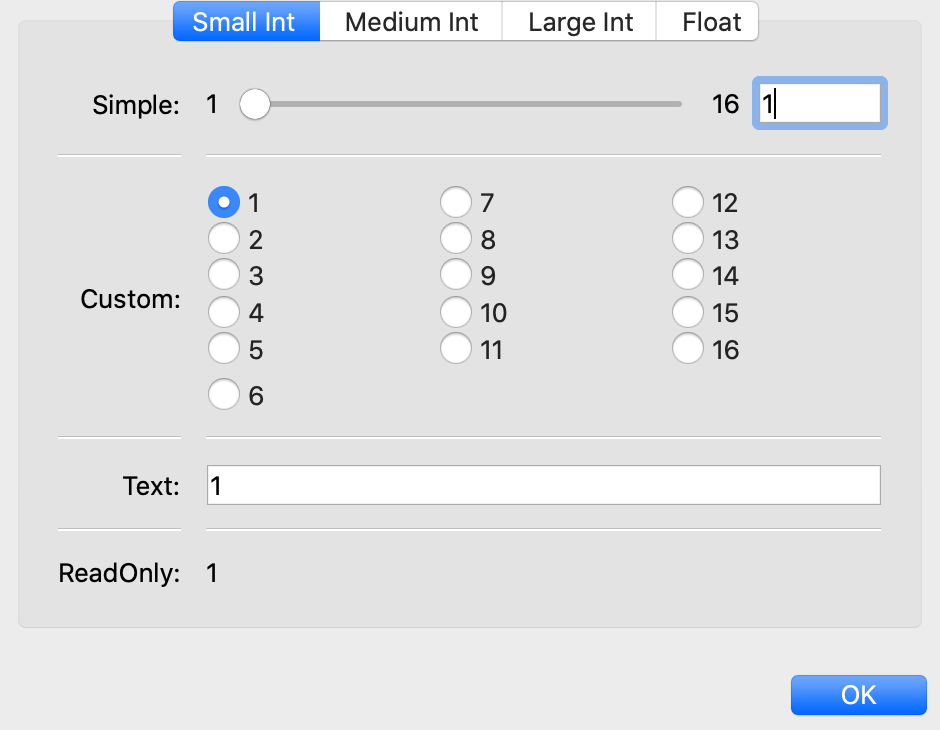
Figure 42: Range editor widgets
In the large-range slider, the arrows on either side of the slider move the editable range, so that the user can move the slider more precisely to the desired value.
You can override the default widget for each type of editor using the mode parameter, which can have the following values:
‘auto’: The default widget, as described in Table 8
‘slider’: Simple slider with text field
‘xslider’: Large-range slider with text field
‘spinner’: Spin box with increment/decrement buttons
‘enum’: Radio buttons
‘text’: Text field
You can set the limits of the range dynamically, using the low_name and high_name parameters to specify trait attributes that contain the low and high limit values; use low_label, high_label and label_width to specify labels for the limits.
RGBColorEditor()
- Suitable for
RGBColor
- Default for
RGBColor
- Optional parameters
mapped
Editors generated by RGBColorEditor() are identical in appearance to those generated by ColorEditor(), but they are used for RGBColor traits. See ColorEditor() for details.
SetEditor()
- Suitable for
List
- Default for
(none)
- Required parameters
Either values or name
- Optional parameters
can_move_all, left_column_title, object, ordered, right_column_title
In the editors generated by SetEditor(), the user can select a subset of items from a larger set. The two lists are displayed in list boxes, with the candidate set on the left and the selected set on the right. The user moves an item from one set to the other by selecting the item and clicking a direction button (> for left-to-right and < for right-to-left).
Additional buttons can be displayed, depending on two Boolean parameters:
If can_move_all is True, additional buttons appear, whose function is to move all items from one side to the other (>> for left-to-right and << for right-to-left).
If ordered is True, additional buttons appear, labeled Move up and Move down, which affect the position of the selected item within the set in the right list box.
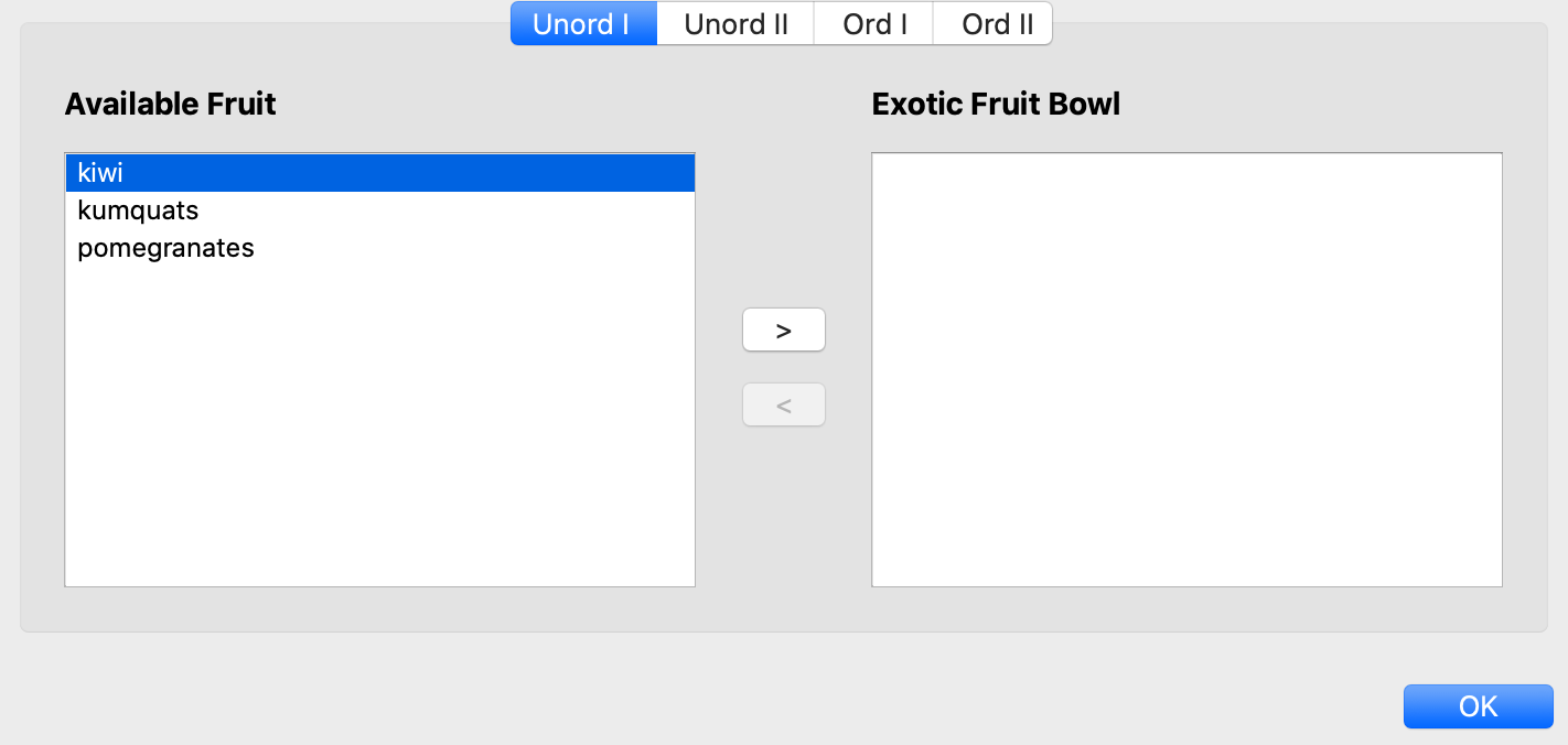
Figure 43: Set editor showing all possible buttons
You can specify the set of candidate items in either of two ways:
Set the values parameter to a list, tuple, dictionary, or mapped trait.
Set the name parameter to the extended name of a trait attribute that contains the list.
ShellEditor()
- Suitable for
special
- Default for
PythonValue
The editor generated by ShellEditor() displays an interactive Python shell.
Figure 44: Python shell editor
TextEditor()
- Suitable for
all
- Default for
Str, String, Password, Unicode, Int, Float, Dict, CStr, CUnicode, and any trait that does not have a specialized TraitHandler
- Optional parameters
auto_set, enter_set, evaluate, evaluate_name, mapping, multi_line, password
The editor generated by TextEditor() displays a text box. For the custom style, it is a multi-line field; for the read-only style, it is static text. If password is True, the text that the user types in the text box is obscured.
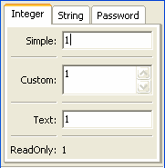
Figure 45: Text editor styles for integers
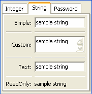
Figure 46: Text editor styles for strings
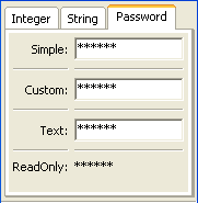
Figure 47: Text editor styles for passwords
You can specify whether the trait being edited is updated on every keystroke
(auto_set=True) or when the user presses the Enter key (enter_set=True).
If auto_set and enter_set are False, the trait is updated when the user
shifts the input focus to another widget.
You can specify a mapping from user input values to other values with the mapping parameter. You can specify a function to evaluate user input, either by passing a reference to it in the evaluate parameter, or by passing the extended name of a trait that references it in the evaluate_name parameter.
TimeEditor()
- Suitable for
Time
- Default for
Time
- Optional parameters
minimum_datetime, strftime
The TimeEditor() displays a Python datetime.time object, usually supplied via a Time trait. The simple style shows a time spin control. For readonly style, the user can set the message to display if the time value is None, and a time format string for use with strftime.
TitleEditor()
- Suitable for
string traits
- Default for
(none)
TitleEditor() generates a read-only display of a string value, formatted as a heading. All styles of the editor are identical. Visually, it is similar to a Heading item, but because it is an editor, you can change the text of the heading by modifying the underlying attribute.
TupleEditor()
- Suitable for
Tuple
- Default for
Tuple
- Optional parameters
cols, editors, labels, traits
The simple and custom editors generated by TupleEditor() provide a widget for each slot of the tuple being edited, based on the type of data in the slot. The text and read-only editors edit or display the text representation of the tuple.
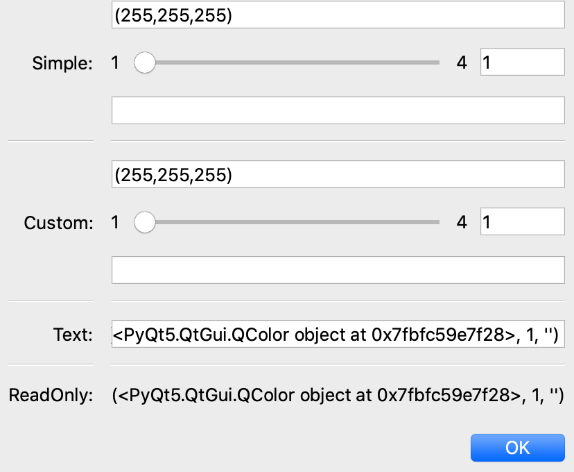
Figure 48: Tuple editor styles
You can specify the number of columns to use to lay out the widgets with the cols parameter. You can specify labels for the widgets with the labels parameter. You can also specify trait definitions for the slots of the tuple; however, this is usually implicit in the tuple being edited.
You can supply a list of editors to be used for each corresponding tuple slot. If the editors list is missing, or is shorter than the length of the tuple, default editors are used for any tuple slots not defined in the list. This feature allows you to substitute editors, or to supply non-default parameters for editors.
ValueEditor()
- Suitable for
(any)
- Default for
(none)
- Optional parameters
auto_open
ValueEditor() generates a tree editor that displays Python values and objects, including all the objects’ members. For example, Figure 49 shows a value editor that is displayed by the “pickle viewer” utility in enthought.debug.
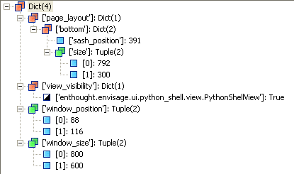
Figure 49: Value editor from Pickle Viewer
Footnotes
- 16
In Traits, a Button and an Event are essentially the same thing, except that Buttons are automatically associated with button editors.
- 17
TraitsUI makes minor modifications to the name, capitalizing the first letter and replacing underscores with spaces, as in the case of a default Item label (see The View Object).
- 18
If a List is made up of HasTraits objects, a table editor is used instead; see TableEditor().
Table of Contents
- The Predefined Trait Editor Factories
- Basic Trait Editor Factories
- ArrayEditor()
- BooleanEditor()
- ButtonEditor()
- CheckListEditor()
- CodeEditor()
- ColorEditor()
- CompoundEditor()
- CSVListEditor()
- DateEditor()
- DatetimeEditor()
- DirectoryEditor()
- EnumEditor()
- FileEditor()
- FontEditor()
- HistoryEditor()
- HTMLEditor()
- ImageEditor()
- ImageEnumEditor()
- InstanceEditor()
- ListEditor()
- LEDEditor()
- ListStrEditor()
- NullEditor()
- RangeEditor()
- RGBColorEditor()
- SetEditor()
- ShellEditor()
- TextEditor()
- TimeEditor()
- TitleEditor()
- TupleEditor()
- ValueEditor()
- Basic Trait Editor Factories